|
|---|
 |
 |
 |
 |
NORTHCOAST MUSIC FESTIVAL
NORTHCOAST MUSIC FESTIVAL
BRANDING
Objective: Merge existing graphics with new elements to create a fresh approach to the festival's branding.
Deliverables: Logo update, website design, branding guidelines, flyer design.
BRANDING
Objective: Merge existing graphics with new elements to create a fresh approach to the festival's branding.
Deliverables: Logo update, website design, branding guidelines, flyer design.
SPRING. MOVEMENT
Co–art directed and expanded the creative for the second year of Spring Movement, the certification arm of East River Pilates. The brand was refined through an updated color palette, cleaner typography, cohesive social templates, photography guidelines, and a structured content calendar. Additionally, creative direction and production were provided for Spring’s first content shoot—shaping the overall look and feel, planning props and wardrobe, and managing the photographer to ensure cohesive, on-brand assets.
SERVICE
Creative Direction | Design
CLIENT
East River Pilates
YEAR
2024-2025


BRANDING
Built on the existing brand foundation to enhance and expand the visual identity through an updated color palette, refined typography, cohesive social media templates, defined photography guidelines, and a structured content calendar.

SOCIAL TEMPLATES
Using the newly developed Spring Movement color palette, a series of adaptable templates were created for multiple platforms, including standard Instagram posts and stories as well as Pinterest. The goal was to maintain visual consistency across all channels while ensuring each piece felt distinctive and dynamic, avoiding repetition while staying true to the brand’s identity.


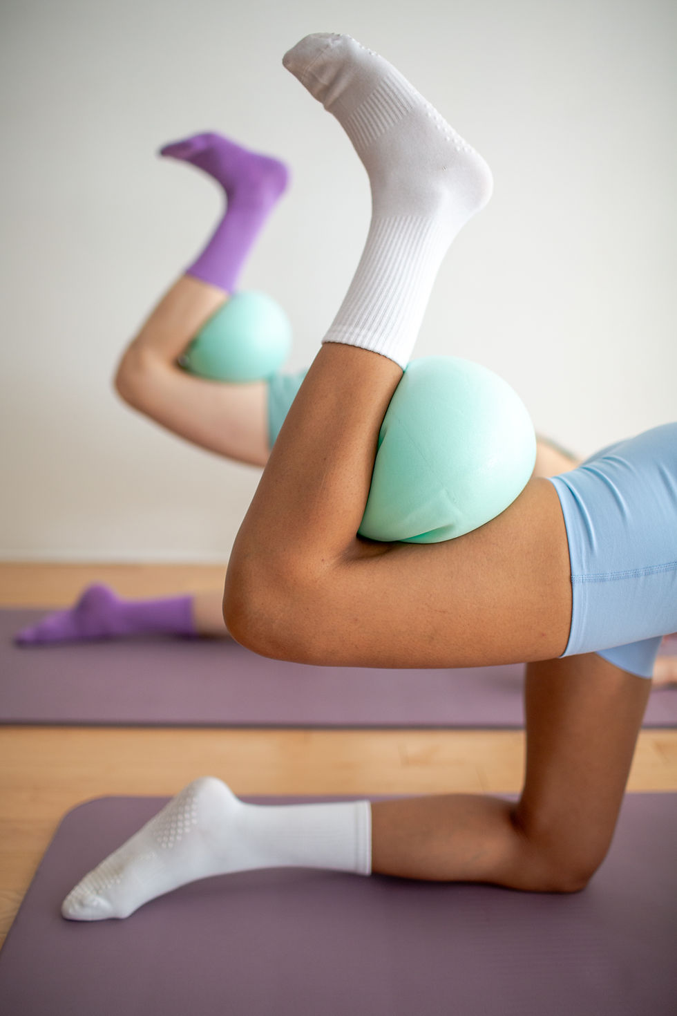
CONTENT SHOOT
Creative directed and produced Spring’s first content shoot, developing the overall look and feel in collaboration with the founders. Worked together to plan props, wardrobe, and the shot list, while sourcing and managing the photographer to ensure cohesive asset delivery. Served as a helpful guide throughout the process to bring the brand’s vision to life.

THE STILLS
Spring’s first content shoot was designed to capture a mix of stylized, lifestyle, and educational imagery, aligning with the established photography guidelines.